TIAA.org
A holistic reimagining of TIAA.org that aligned a new brand with a user-first experience to improve how participants plan for retirement.
Key contributions
Workshop design
UX strategy & design
Content strategy and content development
Data and information design
Functional documentation
● Challenge
Redefine the Retirement Web Experience
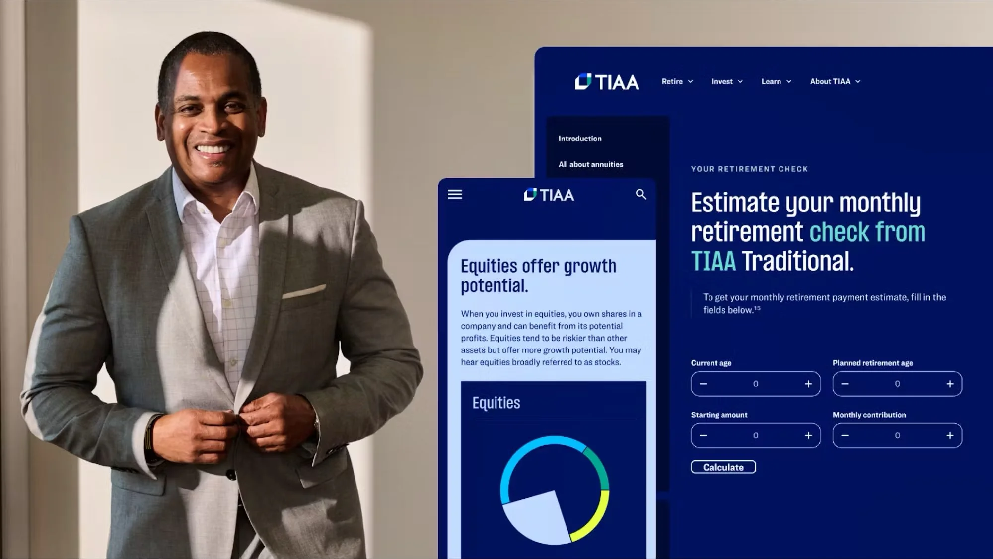
TIAA approached us with an outdated, content-heavy digital experience that made retirement planning feel overwhelming—even for its highly educated audience. At the same time, the organization was undergoing a major brand transformation. They needed a new TIAA.org that would reflect the new brand, simplify complex financial information, provide an engaging digital experience, with a strategic roll out to ensure high-impact pages could begin improving participant retirement outcomes quickly.
● Solution
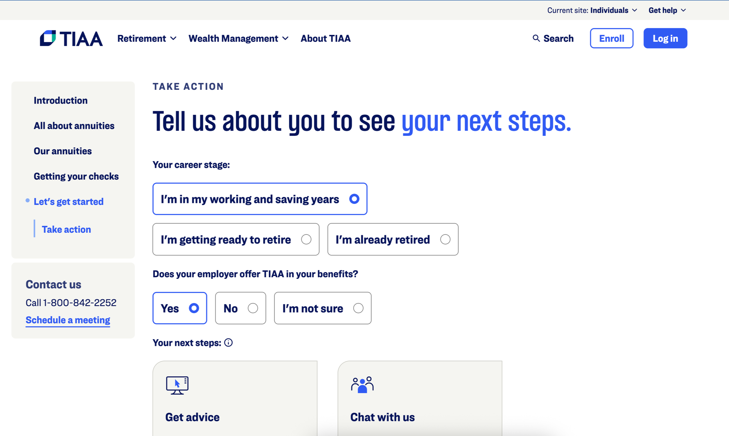
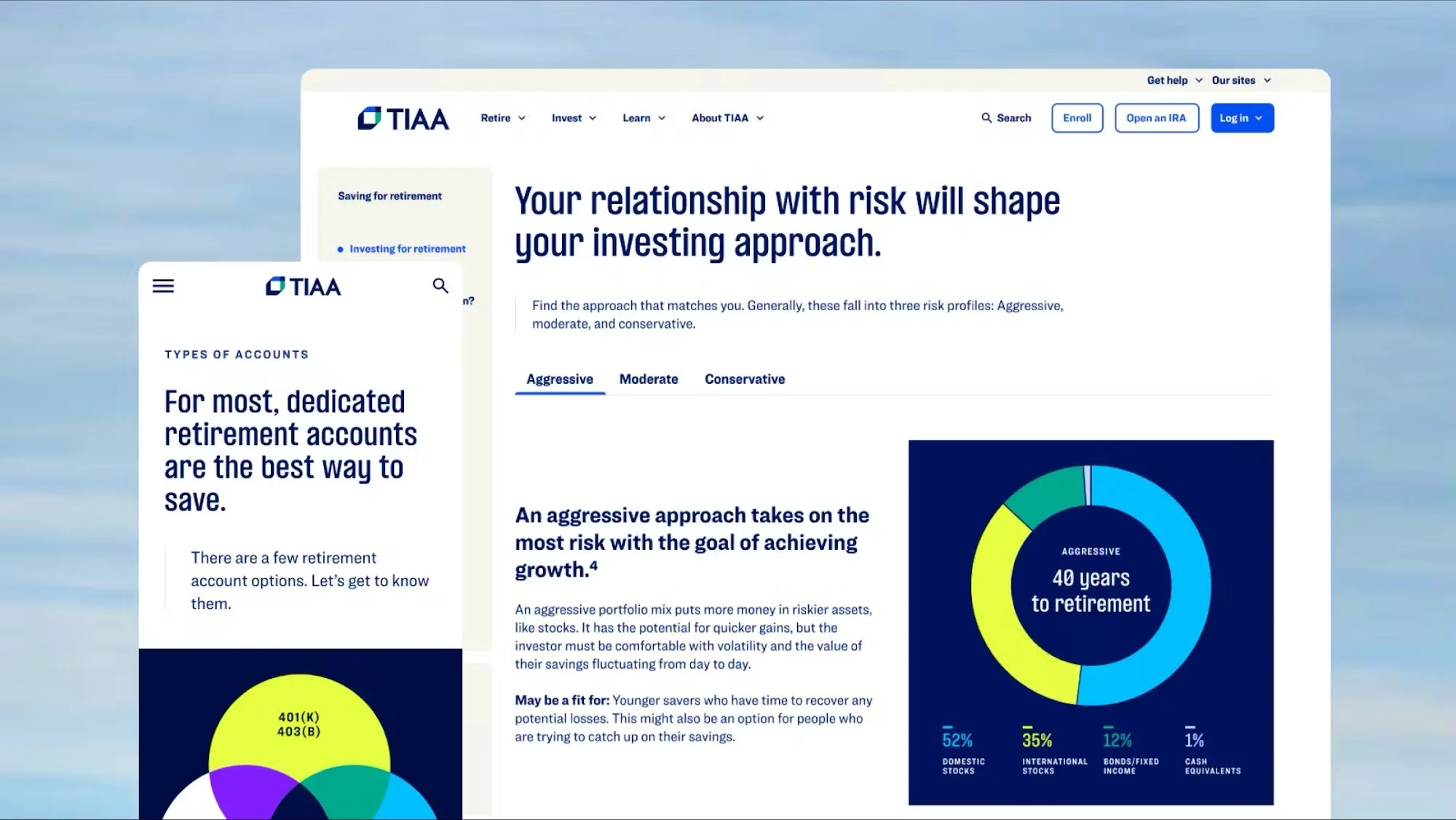
A refreshed site with a new key feature: Educational Flows
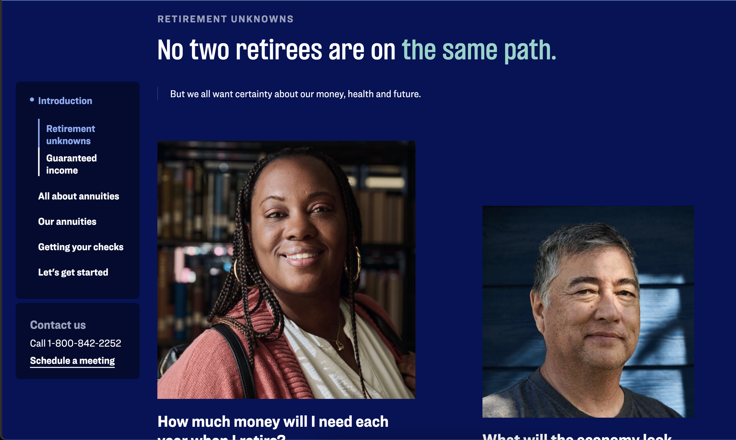
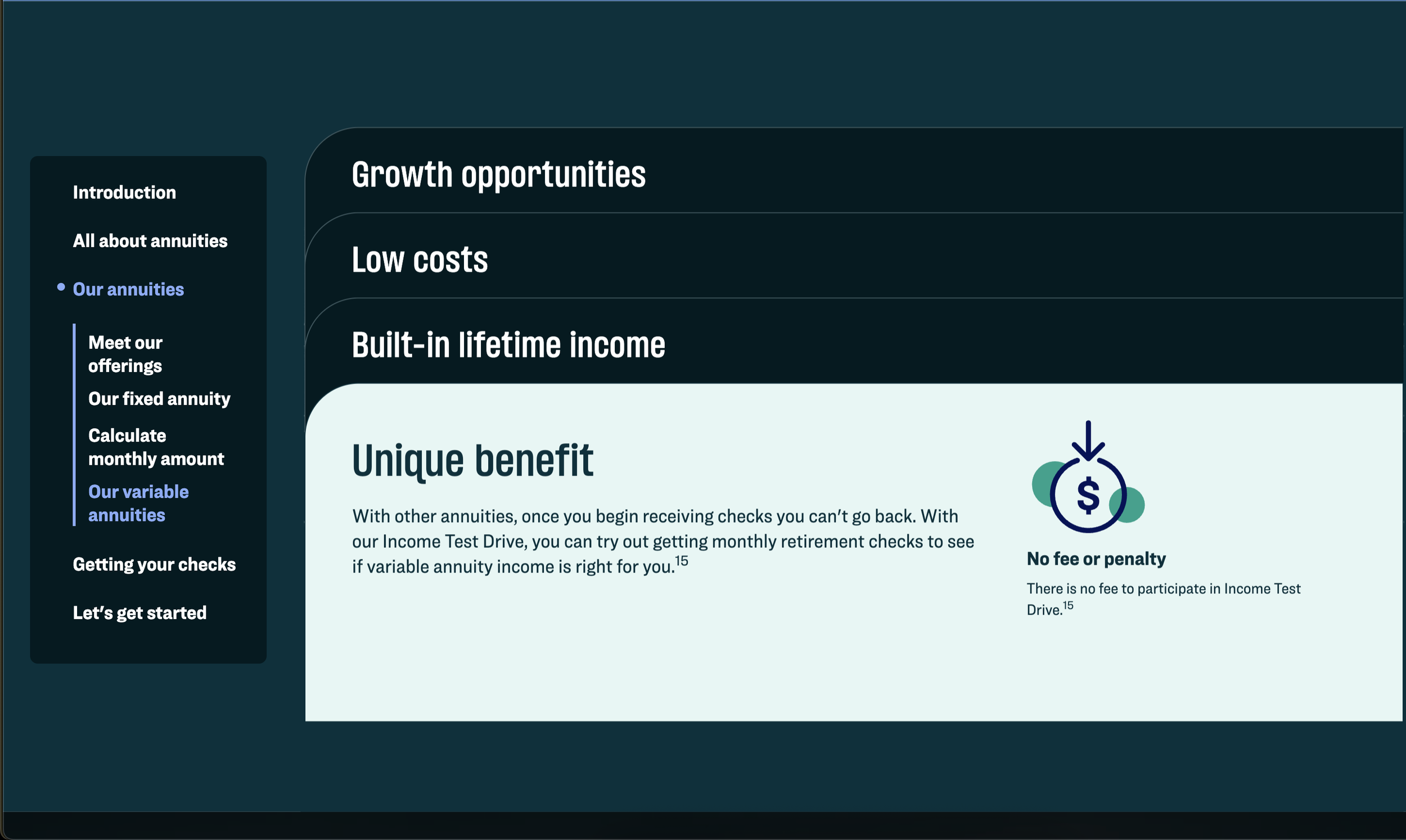
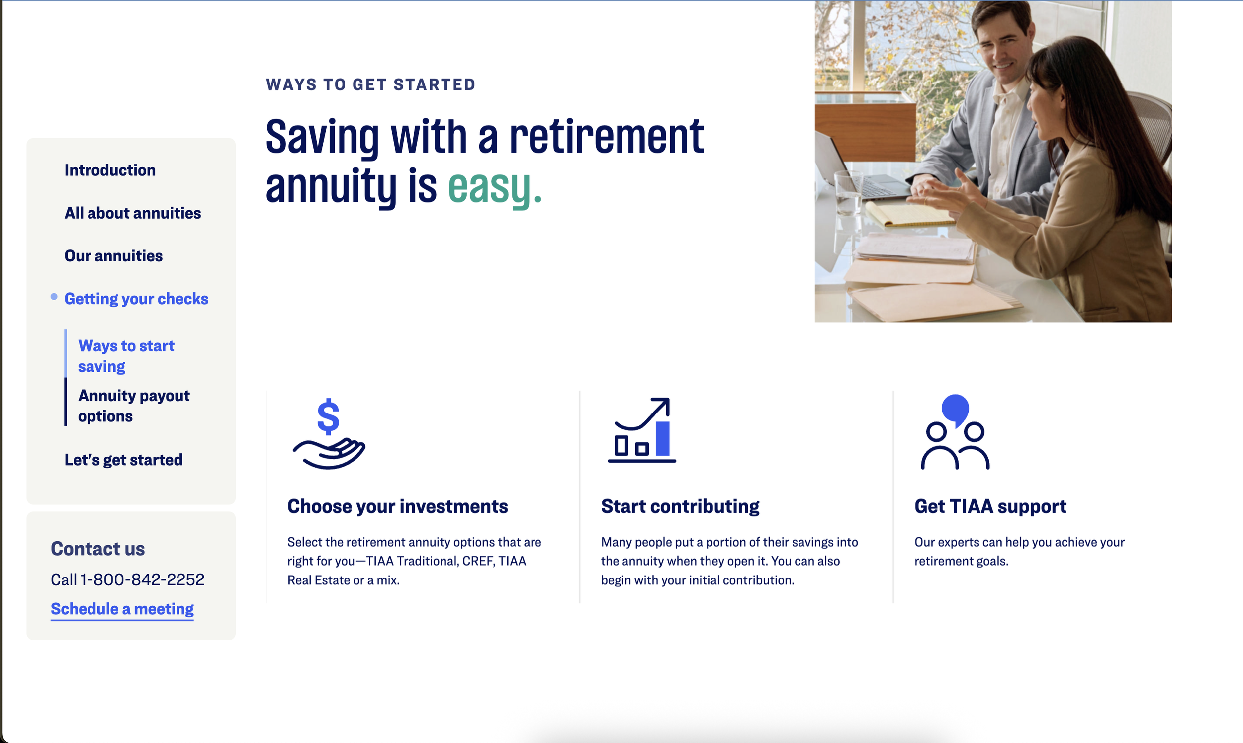
We leveraged TIAA’s new brand and early design system as a foundation to create a flexible library of reusable components that powered the full site experience. At the core of the redesign was a new content format—Educational Flows—an interactive way to break down complex financial topics into guided, digestible steps that build understanding and confidence in decision-making.
Jump to a section
● Objective
Ensure Stakeholder Alignment
Part of our job is to ensure that the work we do makes it out of the conceptual realm and into reality. In order for that to happen the work is signed off on by many different stakeholders, which means ensuring everyone is aligned and enrolled in the vision. For this project that looked like:
Stakeholder interviews
Collaborative workshops
Cross-functional reviews
Thorough feedback collection and documentation
Content workshops
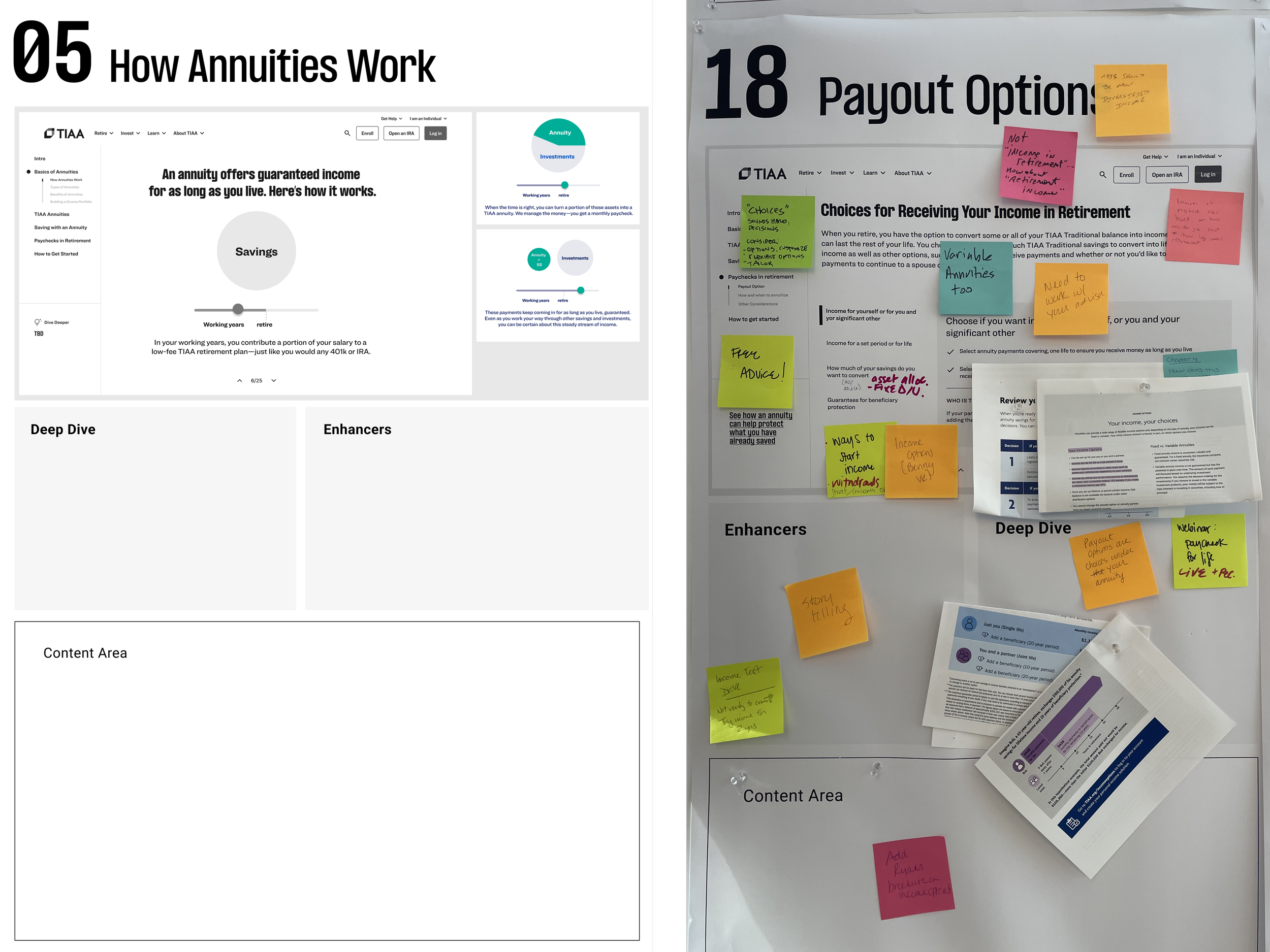
In an effort to ensure stakeholders from across the business were enrolled and aligned, we hosted a number of in-person workshops. I designed and led a set of activities to align business goals, user needs, and content strategy.
As a group we;
Aggregated all the content priorities for each section
Worked through two questions to prioritize content:
What does the user want to know or understand?
What does the business want them to understand?
Examples of content storyboards before and after the worksessions
● Objective
Create an engaging digital experience
Improved site navigation
We restructured TIAA.org’s navigation to make it easier for users to find the right information at the right moment—shifting from product-led menus to clearer, user-focused paths. Through iterative user testing and refinement, we reduced friction and confusion, clarified “where to start,” and ultimately helped participants move the site with greater confidence and efficiency.
Educational flows
Educational Flows reimagined how TIAA delivers financial guidance, replacing long, PDF-heavy content with streamlined, interactive learning modules that guide users through complex topics step-by-step. By consolidating and simplifying content, we significantly reduced the number of web pages and reliance on PDFs, improved comprehension of key financial concepts, and created clearer pathways that increased engagement and advice starts.
Live Examples of Educational Flows
Financial essentials
Understand the basics of budgeting, saving, and managing money.
Lifetime Income
This flow is designed to educate users about an Lifetime Income from annuities.
Planning for two
Make confident decisions together with tips for aligning your goals and timelines.
● Objective
Simplify complex financial information
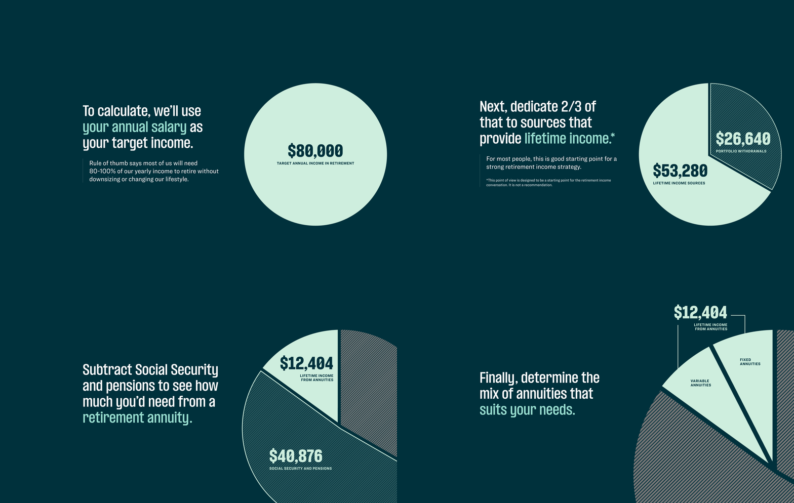
Concept visualization
I led the information design to transform complex financial concepts into clear, intuitive visual frameworks that improved comprehension and guided users toward confident decision-making. Partnering closely with a copywriter and visual designer, I defined the narrative structure, interaction models, and component patterns used to explain key retirement topics—such as annuities, income planning, diversification, and the building blocks of retirement savings. My role focused on simplifying abstract concepts into step-by-step visual learning moments that users could quickly understand, compare, and act on, ultimately making financial education more accessible and engaging across the site.
Data visualization
I led the UX strategy for translating complex financial performance data into interactive visualizations tailored to the needs of institutional and financially sophisticated users. My work focused on defining the narratives, interaction models, and data hierarchies that enabled users to explore scenarios such as returns vs. bonds, annuity growth, payout impacts, and estate outcomes. These visualizations were critical in helping investors evaluate TIAA products through transparent, data-driven comparisons, strengthening trust and supporting more informed investment decisions.
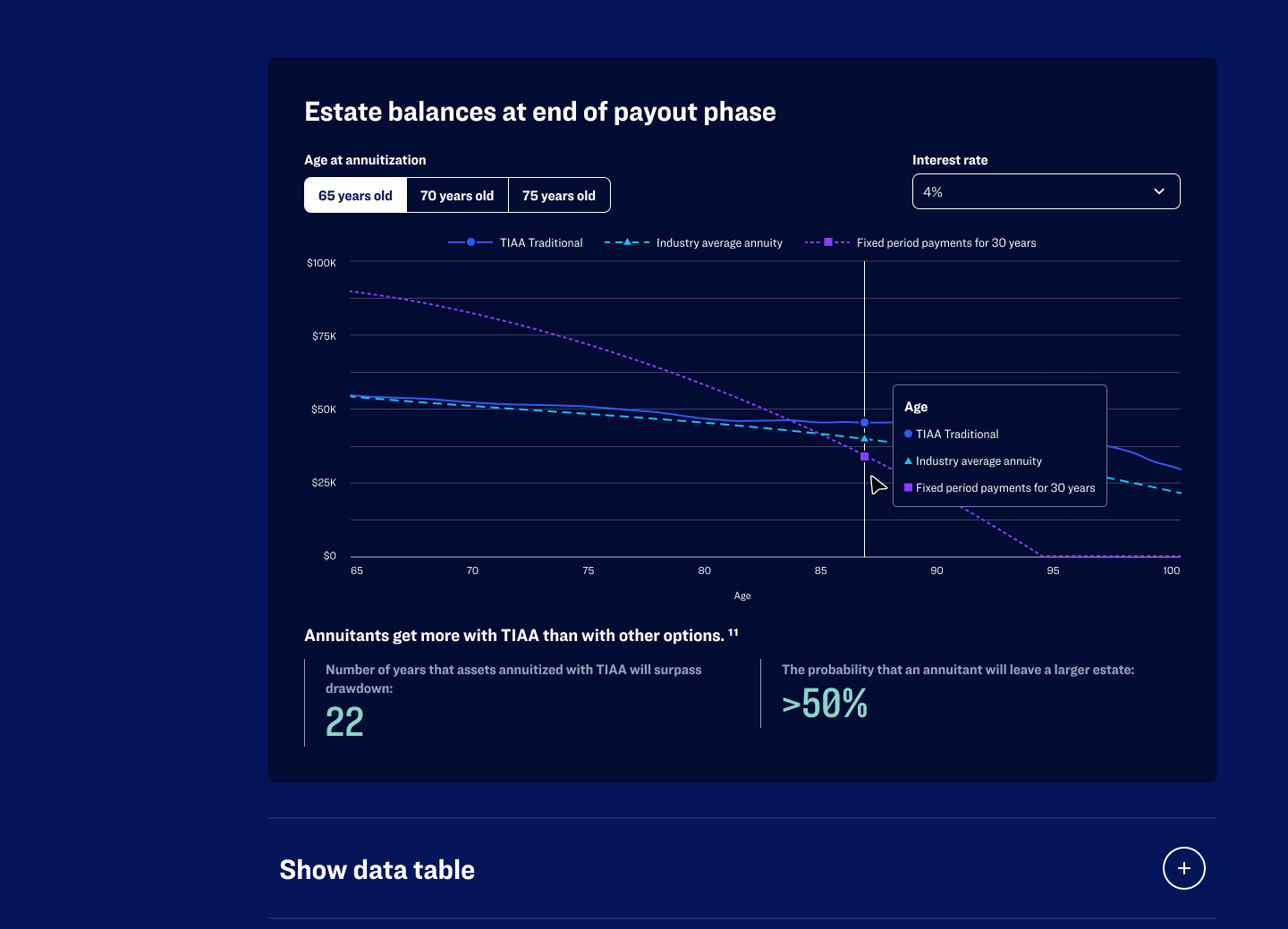
Estate balances at end of payout phase - This graph dispels common misconception that retirees leave a smaller estate balances that a traditional drawdown strategy. This allows the user to manipulate the data to better understand what an estate balance could look like depending on age at annuitization and age upon death.
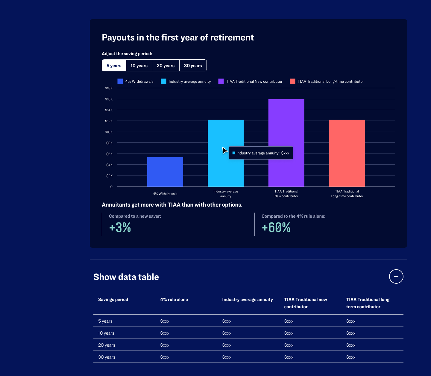
This bar chart shows how different retirement strategies payout in your first year of retirement. The user can see how that changes based on how long the savings period is.
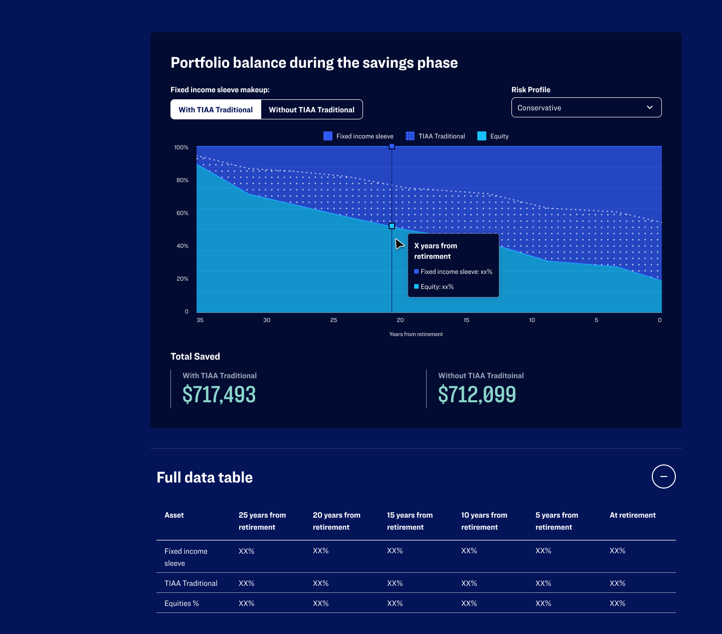
This area graph shows how the makeup of a portfolio changes based on the two variables of with and without TIAA's Annuity product, and risk profile. This graph was intended for investor education rather than end user.
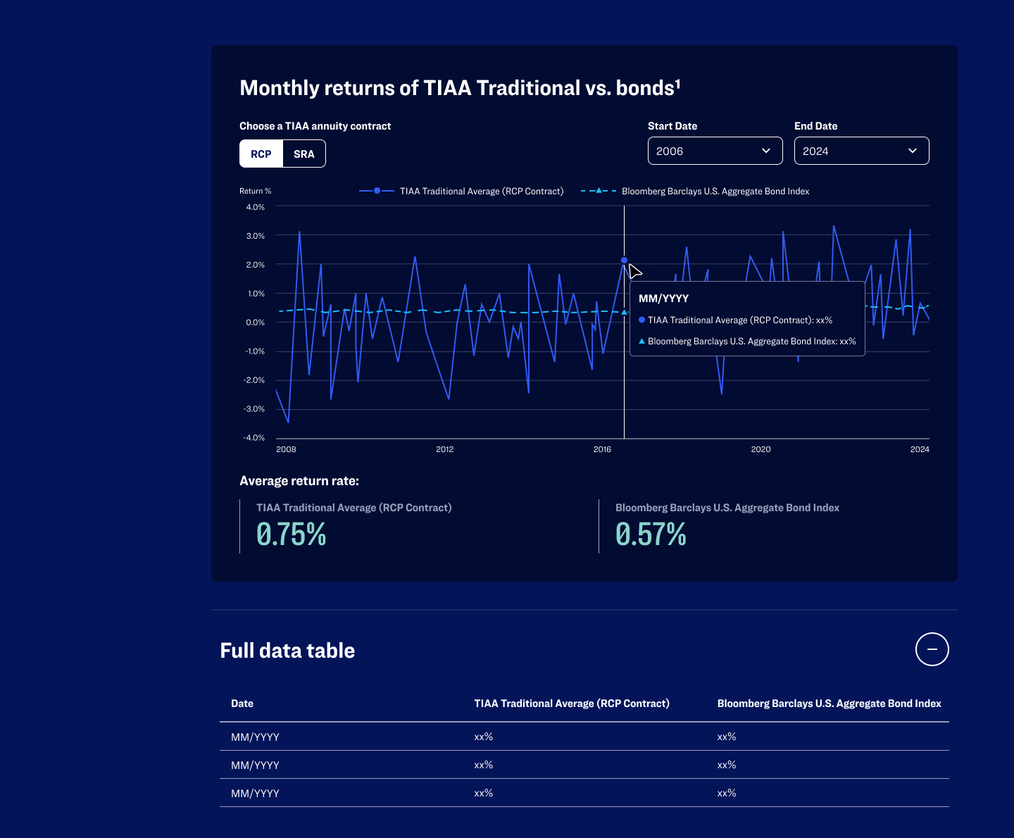
This line graph shows the stability of TIAA's annuity products compared to bonds and allows the user to manipulate the period of time to display the data.
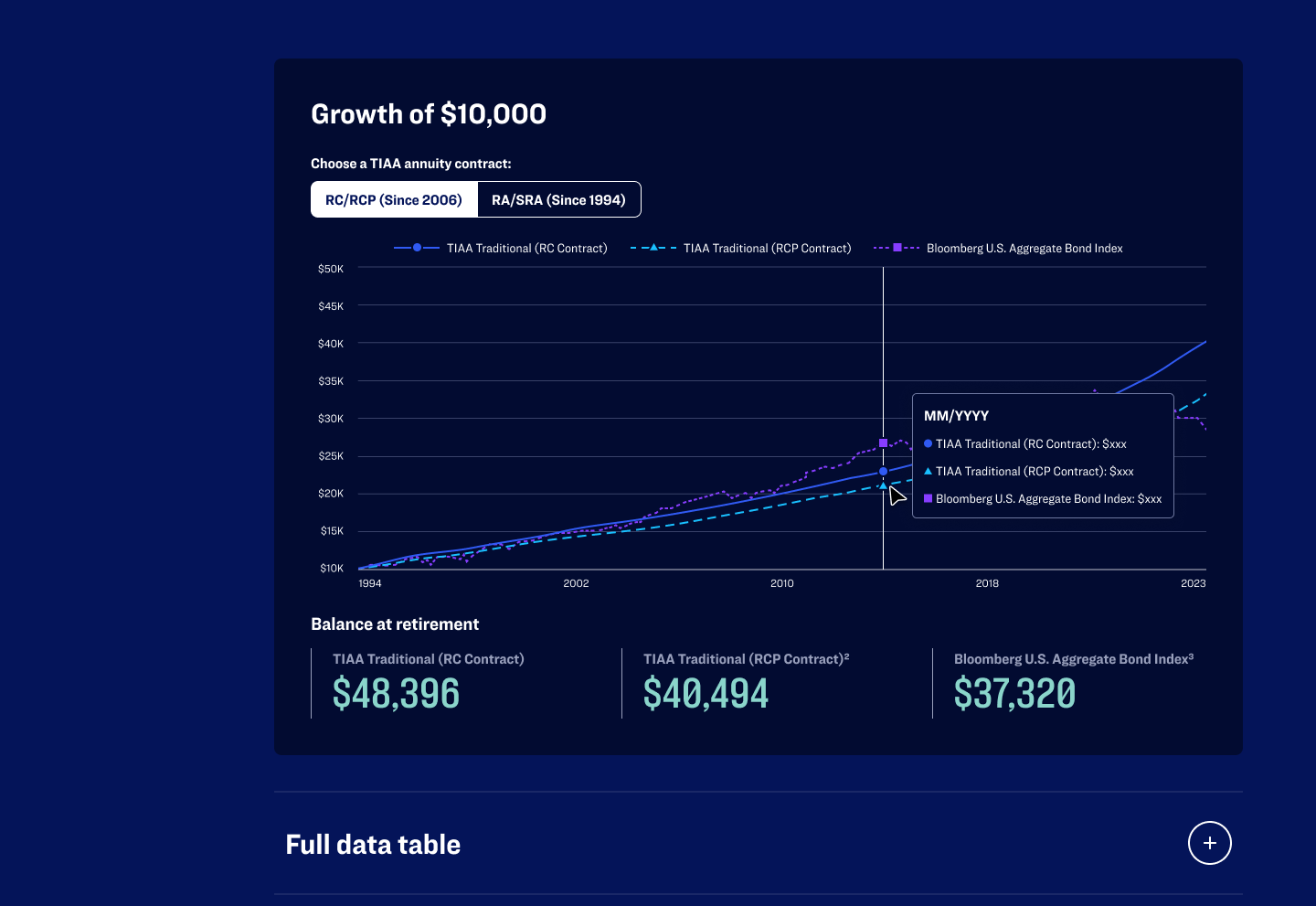
This shows the growth of $10,000 invested in TIAAs annuity contract and the average bond index to show that replacing a bond portion of the portfolio with TIAAs product will return the same or better - a common misconception amongst investors.
● Conclusion
Our team’s keys to success
Cross-discipline alignment: The success stemmed from tight collaboration across content strategy, UX, visual design, engineering and business leadership—highlighting the value of a holistic UX leadership approach.
Balancing simplicity with depth: Financial services design often errs on “safe but dull”. We learned how to offer both digestible, shallow entry-points and deeper dives for users ready to engage.
User needs over business complexity: We continuously advocated for clear, user-first decisions in a space often driven by internal structures, terminology, and product complexity. By grounding decisions in user insight and comprehension—not organizational silos—we transformed dense financial content into experiences that empowered participants to take action.
Enrollment starts from the homepage increased by ~80%.
Advice session starts in the Lifetime Income flow increased ~94%
Bounce rate decreased by 41%.
Users spent ~40% more time on average engaging with content.
SEO rank improved by ~76%
Impact & Awards
“Code and Theory's thoughtful strategy and the way they crafted the narrative helped us effectively tell our story for people at a crucial life stage—preparing for retirement—and the results speak for themselves.”
— Tamara Namaste | Managing Director, Global Head of Web Marketing & Strategic Integration at TIAA and Nuveen
Silver
Website Design
Indigo Awards
Silver
Marketing
W3 Awards
Silver
Website Design 2025
FCS Portfolio awards
Bronze
Shorty Awards
Gold
Digital Tools & Utilities
Indigo Awards
Silver
Website Design
W3 Awards

